I produced my music magazine intentionally to match the criteria of typical conventions of music magazines, firstly using existing magazines as example guidelines and inspiration for the initial design and layout and features phase of the process. Firstly I identified magazines that represented the same genre as I was wanting to make (Indie) NME being the main one.This brand of magazine had been selected as I wanted to create similar style that had been presented in certain issues of the NME magazines. The magazine I created was focused around a young adult audience who have interests surrounding Inide themed music.As mentioned previously I reffered to other magazines constantly throughout the duration of the production on my Front cover, Contents page and double page spread this allowed to stay on track with the design ensuring that my design stayed realistic and conventional.


To retain more knowledge about this genre of magazine I decided that I would analyse an NME magazine. The analysis helped me to identify the conventions of typical magazines for example I began to understand the positioning of certain elements such as the masthead,contents page layouts and double page spread orientation. I figured that for the front cover I would make the text larger than I initially planned as I noticed that NME had used frequently throughout most of the magazine issues they have released.
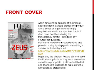
On the front cover, the large red text came from this NME issue - without this my overall cover lacked any form of energy without this it wasn't very busy at all so luckily this added a form of suspense. I used a variation of three different colours red,black and white throughout the front cover in order to keep a consistent colour scheme following the same principle as the NME magazine did.
Furthermore carrying out more research and completing a additional analysis inspired me to have a design that followed a different concept in relation to what the majority of double page spreads look like. From the photoshoot I carried outI decided to choose an image that would be suitable to fit one side of the double page spread well but would also be able to relate to the mood set by the colours that will be used on my double page spread. The image I finalised on framed well I used a variety of fonts for the spread making it more aesthetically presentable.
NME acted as my main inspiration throughout the process although not as much so for the double page spread. Adding the additional concepts of "Z" being transparent so the image is visible I felt contributed to the overall double page spread. I felt it would appeal to the audience and also created a theme. Whilst coming up with the magazines design style, I gathered ideas of different fonts that I would be able to use I looked through a range of existing products. The font I looked at for the masthead on the front covet was original and just a font that was accessible on the photoshop software itself. For the magazine name/branding had to be reasonable therefore it would fit in the allocated space although it had to be catchy enough for people to remember it. I went through a short process of creating numerous possible choices Fusion and Fuel were the ones I felt more confident in using.
After using existing products as guidelines,some of the features of Fuel challenge the typical appearance of music magazines.For example, I originally aimed to have darker images although. However the images I used in my final products turned out to be lighter. Fortunately using other magazines and experimenting with the different tools available in photoshop it allowed me to produce something I was satisfied with. The end result allowed it to fit in with typical magazine in comparison to the appearance prior to any editing images.
The contents page production varied in comparison to the front cover. First I began to experiment with different layouts until it looked presentable, although along the process of creating the contents page I noticed that it would be possible use some of ideas used on this particular contents page and transfer them on to my own. Considering my own experimentation I think that overall my contents page looked professional and well structured in the end even without following similar concepts as other magazines have done so in their own versions of contents pages.
My media product challenges typical features of music magazines as I chose a music topic that isn't covered in many magazines. This meant I had to explore a range of different magazines to base mine around most magazines I was looking at were focused upon an older audience than what I was planning on to do so. I choose to look at NME and Q as these two magazines already appealed to the same target audience that I was aiming for, they were both positive examples of existing exciting magazines that I could make reference. The artists my magazines proposed to focus on mixed with Indie Rock and a small proportion on just Rock. This meant it wasn't going to be just a conventional Indie Magazine although it mainly edged towards the Indie Rock genre. NME and Q do have areas in which they cover Indie Rock therefore it made sense to look at these example for ideas and knowledge in what should be included in my magazine.
2)How does your media product represent particular social groups?
In the early development plan for my product I finalised on the music genre I was selecting to focus on this being Indie Rock. Indie Rock is a genre of alternative rock that originated in the untied states and the United Kingdom in the 1980s. Indie Rock is considered extremely diverse, with sub-geners that include indie pop and lo-fi among others. Examples of Indie Rock are Catfish and the Bottlemen, Sundara Karma, The Kooks and many more.My aim was to spotlight this music type by integrating it to appeal to a young adult audience to prove that it appeals to a variety of different age groups.


No comments:
Post a Comment