Friday, 22 April 2016
Monday, 21 March 2016
EVALUATION
In what ways does your media product use, develop or challenge from and conventions of real media products?
I produced my music magazine intentionally to match the criteria of typical conventions of music magazines, firstly using existing magazines as example guidelines and inspiration for the initial design and layout and features phase of the process. Firstly I identified magazines that represented the same genre as I was wanting to make (Indie) NME being the main one.This brand of magazine had been selected as I wanted to create similar style that had been presented in certain issues of the NME magazines. The magazine I created was focused around a young adult audience who have interests surrounding Inide themed music.As mentioned previously I reffered to other magazines constantly throughout the duration of the production on my Front cover, Contents page and double page spread this allowed to stay on track with the design ensuring that my design stayed realistic and conventional.


The images that are portrayed on the moodboard demonstrate existing products,themes, fonts and images.This allowed to take inspiration and ideas into what makes a strong overall magazine product.
To retain more knowledge about this genre of magazine I decided that I would analyse an NME magazine. The analysis helped me to identify the conventions of typical magazines for example I began to understand the positioning of certain elements such as the masthead,contents page layouts and double page spread orientation. I figured that for the front cover I would make the text larger than I initially planned as I noticed that NME had used frequently throughout most of the magazine issues they have released.
I produced my music magazine intentionally to match the criteria of typical conventions of music magazines, firstly using existing magazines as example guidelines and inspiration for the initial design and layout and features phase of the process. Firstly I identified magazines that represented the same genre as I was wanting to make (Indie) NME being the main one.This brand of magazine had been selected as I wanted to create similar style that had been presented in certain issues of the NME magazines. The magazine I created was focused around a young adult audience who have interests surrounding Inide themed music.As mentioned previously I reffered to other magazines constantly throughout the duration of the production on my Front cover, Contents page and double page spread this allowed to stay on track with the design ensuring that my design stayed realistic and conventional.


To retain more knowledge about this genre of magazine I decided that I would analyse an NME magazine. The analysis helped me to identify the conventions of typical magazines for example I began to understand the positioning of certain elements such as the masthead,contents page layouts and double page spread orientation. I figured that for the front cover I would make the text larger than I initially planned as I noticed that NME had used frequently throughout most of the magazine issues they have released.
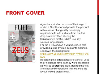
On the front cover, the large red text came from this NME issue - without this my overall cover lacked any form of energy without this it wasn't very busy at all so luckily this added a form of suspense. I used a variation of three different colours red,black and white throughout the front cover in order to keep a consistent colour scheme following the same principle as the NME magazine did.
Furthermore carrying out more research and completing a additional analysis inspired me to have a design that followed a different concept in relation to what the majority of double page spreads look like. From the photoshoot I carried outI decided to choose an image that would be suitable to fit one side of the double page spread well but would also be able to relate to the mood set by the colours that will be used on my double page spread. The image I finalised on framed well I used a variety of fonts for the spread making it more aesthetically presentable.
NME acted as my main inspiration throughout the process although not as much so for the double page spread. Adding the additional concepts of "Z" being transparent so the image is visible I felt contributed to the overall double page spread. I felt it would appeal to the audience and also created a theme. Whilst coming up with the magazines design style, I gathered ideas of different fonts that I would be able to use I looked through a range of existing products. The font I looked at for the masthead on the front covet was original and just a font that was accessible on the photoshop software itself. For the magazine name/branding had to be reasonable therefore it would fit in the allocated space although it had to be catchy enough for people to remember it. I went through a short process of creating numerous possible choices Fusion and Fuel were the ones I felt more confident in using.
After using existing products as guidelines,some of the features of Fuel challenge the typical appearance of music magazines.For example, I originally aimed to have darker images although. However the images I used in my final products turned out to be lighter. Fortunately using other magazines and experimenting with the different tools available in photoshop it allowed me to produce something I was satisfied with. The end result allowed it to fit in with typical magazine in comparison to the appearance prior to any editing images.
The contents page production varied in comparison to the front cover. First I began to experiment with different layouts until it looked presentable, although along the process of creating the contents page I noticed that it would be possible use some of ideas used on this particular contents page and transfer them on to my own. Considering my own experimentation I think that overall my contents page looked professional and well structured in the end even without following similar concepts as other magazines have done so in their own versions of contents pages.
My media product challenges typical features of music magazines as I chose a music topic that isn't covered in many magazines. This meant I had to explore a range of different magazines to base mine around most magazines I was looking at were focused upon an older audience than what I was planning on to do so. I choose to look at NME and Q as these two magazines already appealed to the same target audience that I was aiming for, they were both positive examples of existing exciting magazines that I could make reference. The artists my magazines proposed to focus on mixed with Indie Rock and a small proportion on just Rock. This meant it wasn't going to be just a conventional Indie Magazine although it mainly edged towards the Indie Rock genre. NME and Q do have areas in which they cover Indie Rock therefore it made sense to look at these example for ideas and knowledge in what should be included in my magazine.
2)How does your media product represent particular social groups?
In the early development plan for my product I finalised on the music genre I was selecting to focus on this being Indie Rock. Indie Rock is a genre of alternative rock that originated in the untied states and the United Kingdom in the 1980s. Indie Rock is considered extremely diverse, with sub-geners that include indie pop and lo-fi among others. Examples of Indie Rock are Catfish and the Bottlemen, Sundara Karma, The Kooks and many more.My aim was to spotlight this music type by integrating it to appeal to a young adult audience to prove that it appeals to a variety of different age groups.
Although representing this genre meant I had to create imaginary artists, to allowed to follow the regulations (original photo requirement). Using existing bands or musicians as inspiration I made one original musician in this it was myself. The main feature article artist, me was not based on anyone specific. I altered the name to Zues this was an original abstract name which correlated with the genre I was presenting. For the main photoshoot, I took inspiration again looking at magazines predominantly NME. I experimented with a variety of shots and a range of different props and different lighting setting.
3) What kind of media institution might distribute your media product and why?
4) Who would be the audience for your media product?
5) How did you attract/ address your audience?
Throughout the designing process I was always trying to make sure that the look remained professional. After producing the final front cover I think it would suitable to clarify that the font choices I made helped create the professional look but was also relevant for the mood I was making.In my contents page I offered the a deal to the customers this is a conventional feature that is common inside most magazines.
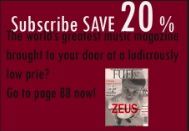
Nearly every magazine I looked in for guidance and inspiration all had some form of advertisement visible. I made my own to conform the conventions of magazines, but also to attract the audience. The age group of my magazine I wanted to be not too young or old, so in the main article I wrote in a way that would appeal to both this being in a way that I know someone my age group would read. The overall actual design so aesthetics of the product I wanted to remain a professional look by maintaining a recurring black and white color scheme this would prove evidence of sophistication. Although I used a variety of different fonts to provide positive energy this being intentionally used to reach out to my audience.

6) What have you learnt about technology from the process of constructing this product?
I think it has been shown very clearly that from the original preliminary college magazine I have improve significantly. I have learnt a lot about Photoshop this coming from tutorials and advice provided to me by teachers or doing my own independent learning and watching YouTube videos over the course of the product production I have learnt to use Photoshop in a more effective manor applying effects to images whilst using the tools available when necessary. Learning more techniques and gradually becoming more efficient with tools etc benefited me massively. This form of technology was the most valuable by far as I had to use it as it is what I did all of the magazine construction, editing and experimenting on.
The images that feature throughout the magazine were taken with a professional camera. It meant my product would be of a higher standard as it meant this photo had a higher amount of resolutions. I still don't have a full understand of how to the camera to the best of it's ability although I have been able to gain experience and use some of the features the camera has to offer. The shots turned out a lot better in comparison to the college magazine when I used an iPhone 4 camera.
7)Looking back at the preliminary task,what do you feel you have learnt in the progression from it to the full product?
Since the preliminary task, I feel as though I have made positive progression in many different areas.At the end of the time scale we was set for the college magazine I felt as though my didn't look that bad at the time, and now looking back at it the final product for that was very low in quality. But I think it was understandable because that time I didn't have as much of an understanding of how Photoshop worked I was inexperienced and that's what I believe is the difference between my first college magazine task and my overall final product. Since then, I have learnt how to use Photoshop more effectively due to being able to use in lessons and free periods when completing course work tasks this had allowed me to discover new and effects that I could apply to my magazine.
The college magazine was quite unprofessional as I had a very limited understanding of how to use any of the tools available on the software. Another factor that had a negative effect on the quality of the college magazine was the camera choice in this case I used an iPhone 4 for the photographs. The photo shoot was also taken outside which made it harder to get a high quality image. Now I know how to use Photoshop well enough, so this is something I have progressed on. I also think I understand the conventions and features of a magazine a lot better than before. My understand gradually improved and I tried to apply this to Fuel in the best way possible.
Lastly I feel that the main progress I have made is due to improvement of learning how to use photoshop, and having done research into magazines to base mine on - both making my magazine more realistic and professional. Since the preliminary take I then used the camera provided at college which was more professional in addition to this it improved the quality of the shots I used therefore making my magazine pictures a lot better visually, adding to the overall quality.
3) What kind of media institution might distribute your media product and why?
4) Who would be the audience for your media product?
5) How did you attract/ address your audience?
Throughout the designing process I was always trying to make sure that the look remained professional. After producing the final front cover I think it would suitable to clarify that the font choices I made helped create the professional look but was also relevant for the mood I was making.In my contents page I offered the a deal to the customers this is a conventional feature that is common inside most magazines.

Nearly every magazine I looked in for guidance and inspiration all had some form of advertisement visible. I made my own to conform the conventions of magazines, but also to attract the audience. The age group of my magazine I wanted to be not too young or old, so in the main article I wrote in a way that would appeal to both this being in a way that I know someone my age group would read. The overall actual design so aesthetics of the product I wanted to remain a professional look by maintaining a recurring black and white color scheme this would prove evidence of sophistication. Although I used a variety of different fonts to provide positive energy this being intentionally used to reach out to my audience.

6) What have you learnt about technology from the process of constructing this product?
I think it has been shown very clearly that from the original preliminary college magazine I have improve significantly. I have learnt a lot about Photoshop this coming from tutorials and advice provided to me by teachers or doing my own independent learning and watching YouTube videos over the course of the product production I have learnt to use Photoshop in a more effective manor applying effects to images whilst using the tools available when necessary. Learning more techniques and gradually becoming more efficient with tools etc benefited me massively. This form of technology was the most valuable by far as I had to use it as it is what I did all of the magazine construction, editing and experimenting on.


The images that feature throughout the magazine were taken with a professional camera. It meant my product would be of a higher standard as it meant this photo had a higher amount of resolutions. I still don't have a full understand of how to the camera to the best of it's ability although I have been able to gain experience and use some of the features the camera has to offer. The shots turned out a lot better in comparison to the college magazine when I used an iPhone 4 camera.
7)Looking back at the preliminary task,what do you feel you have learnt in the progression from it to the full product?
Since the preliminary task, I feel as though I have made positive progression in many different areas.At the end of the time scale we was set for the college magazine I felt as though my didn't look that bad at the time, and now looking back at it the final product for that was very low in quality. But I think it was understandable because that time I didn't have as much of an understanding of how Photoshop worked I was inexperienced and that's what I believe is the difference between my first college magazine task and my overall final product. Since then, I have learnt how to use Photoshop more effectively due to being able to use in lessons and free periods when completing course work tasks this had allowed me to discover new and effects that I could apply to my magazine.
The college magazine was quite unprofessional as I had a very limited understanding of how to use any of the tools available on the software. Another factor that had a negative effect on the quality of the college magazine was the camera choice in this case I used an iPhone 4 for the photographs. The photo shoot was also taken outside which made it harder to get a high quality image. Now I know how to use Photoshop well enough, so this is something I have progressed on. I also think I understand the conventions and features of a magazine a lot better than before. My understand gradually improved and I tried to apply this to Fuel in the best way possible.
Lastly I feel that the main progress I have made is due to improvement of learning how to use photoshop, and having done research into magazines to base mine on - both making my magazine more realistic and professional. Since the preliminary take I then used the camera provided at college which was more professional in addition to this it improved the quality of the shots I used therefore making my magazine pictures a lot better visually, adding to the overall quality.
Subscribe to:
Posts (Atom)


